For a long time now I’ve wanted to update the website in order to have much larger pictures display on my photography blog. The width on blog posts had been one of 640 pixels. This is a great width for text, but not so much for images. To compensate for this I had the images linked to larger versions which would open as a pop-up. This kept me content for a long time, but then in the last 6 months or so I really started getting the urge to find a better solution.
The overall width of the site was set at 1040 pixels and I started playing around with the idea of redesigning the site so that images on the photography blog would be 1040 pixels wide. Going from edge to edge. I had a lot of concerns on how this would affect other elements. Clearly the width of paragraphs could not be set at such a wide width as they would not read well. Elements like the sidebar would have to be removed. Would it make the site less navigate-able?
Finally I decided to just get going with it and sort the rest out as I went along. I want this site to become more and more a source of photojournalism a mixture of great sports photography and great text. This change is a necessary step in that direction. Images large enough to draw you in, accompanied by what I hope is well written text.
The result
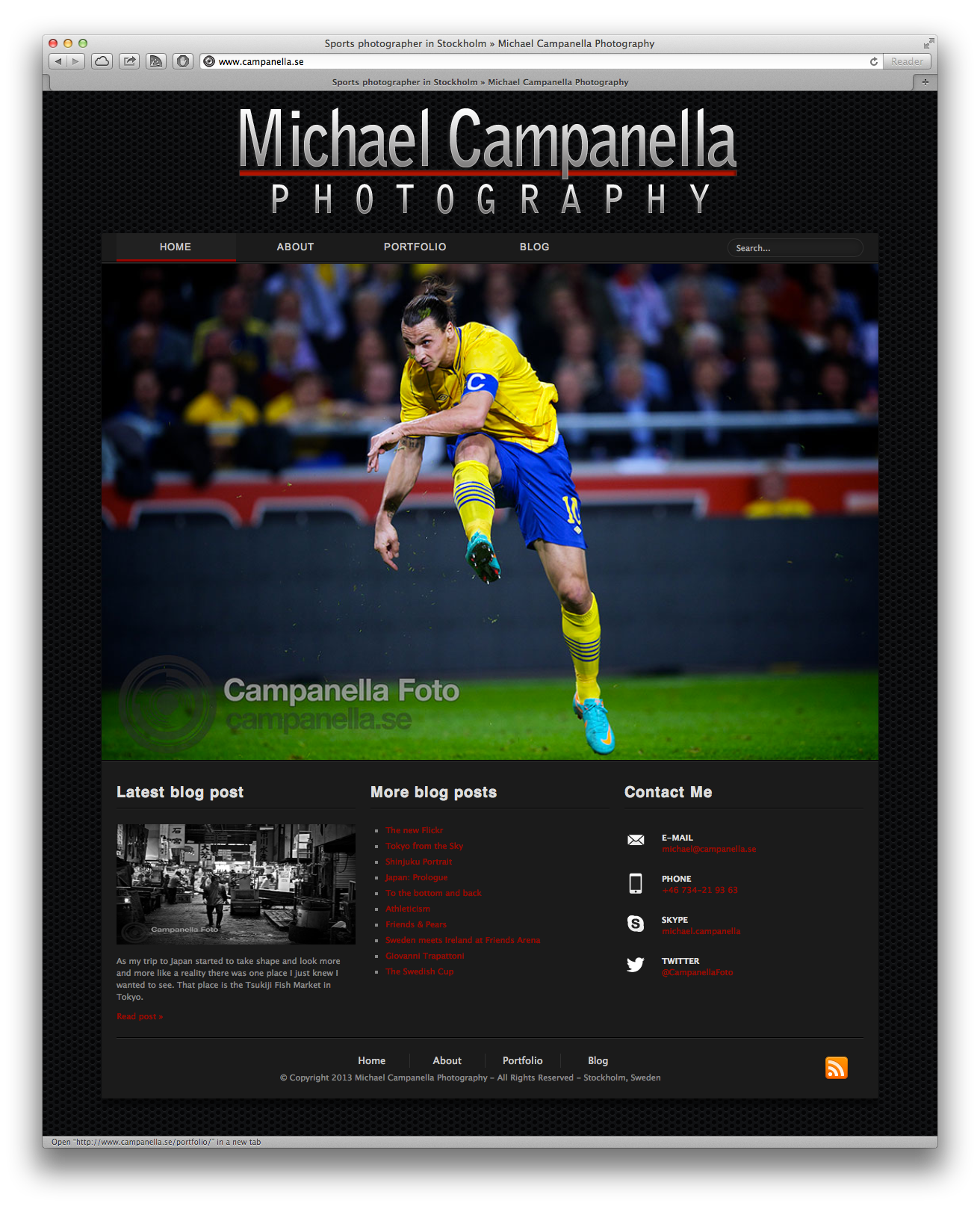
Bellow you can see a full shot of the front page. The logo has been enlarged, I might redesign it completely in the future. The navigation has been re-worked and now contains the site search input. The navigation along with the footer frame the site. Above & bellow. No more borders on the side, although a shadow remains to give it depth from pattern in the background. The pictures in the slideshow are now longer contained in a frame and now these images go edge to edge.
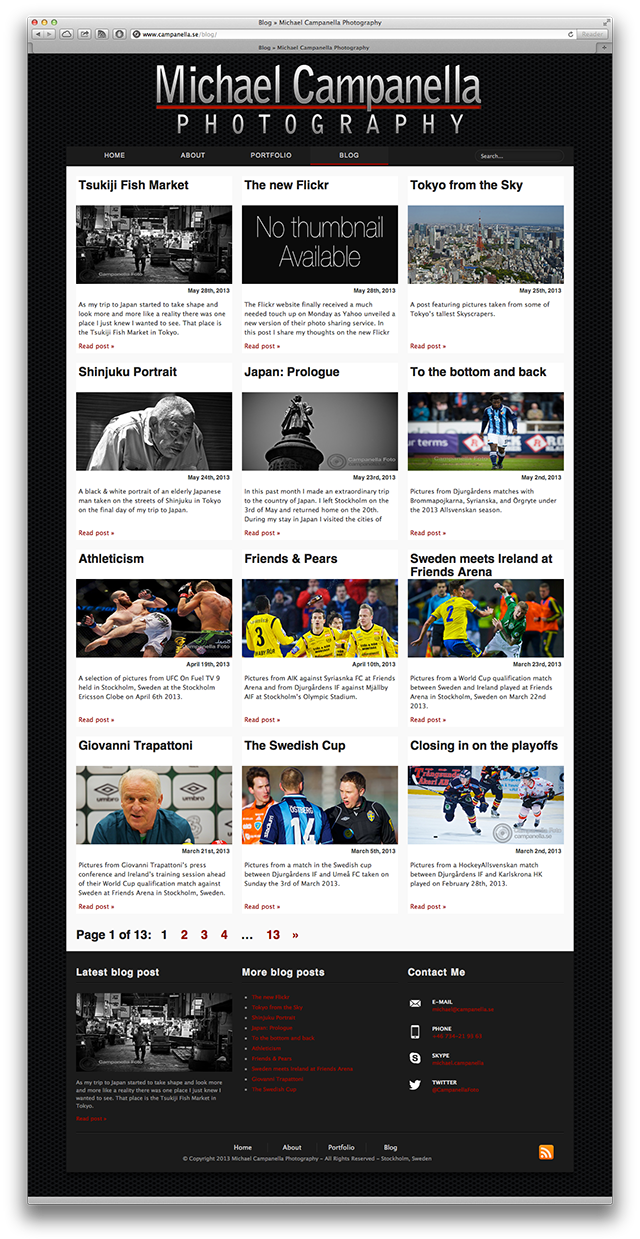
Looking at a shot of the blog index page and you can see that here things really start to change. Gone is the sidebar, with it’s links to categories & archives. The posts now appear in a grid with four rows of three posts. For each of these posts the title, thumbnail, and summary are displayed. In the beginning I was a bit concerned with losing the sidebar, but now that I look at the end result I wonder why I didn’t do it a year ago.
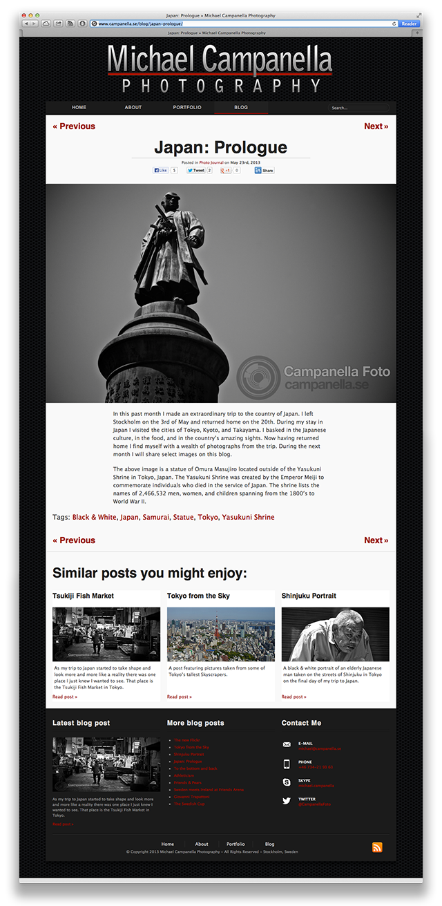
Finally we come to single post, the catalyst for this redesign. As can be seen landscape images now stretch the full width of the website. The text remains with a width 640 pixels and has been enlarged to fit in with the bigger images. Previous and Next post links appear above and beneath the post. They are also much larger, one issue I felt with the previous design is that those elements tended to disappear when viewing the site on a tablet. The related posts are no longer an ugly list but now appear in a row and show the post thumbnail and summary hopefully making them much more inviting.
But it’s still a work in progress
Ultimately this remains a work in progress. With so much material on the site I had to flip the switch and see how it all looked. Having done that there remains a lot of stuff to deal with. Lots of minor nitpicking things. For example the font size of paragraphs feels just right on my laptop, but it feels a little bit too small on my iPad. Some of the post thumbnails are a bit blurry as then are being stretched from their previous size to a larger size.
There are also other concerns. Like should the site be responsive? The big trend in web design at the moment is to design “responsive” sites that expand and contract to fit the screen sizes of various devices. The rule of thumb in this is to design for a mobile phone first and make it expand from there.
I did not do this.
If anything I was planning to do the opposite. Start large and go back and work on a small screen version. Theoretically it could be fairly simple. From a max width of 1040 pixels we adopt a width of 640 pixels on mobiles. Paragraphs contained in a width of 520 pixels with their font size adjusted accordingly.
However there are some caveats, especially for a photography site. Dealing with all the images is not entirely simple. As a matter of fact, it’s actually quite a pain in the ass. If you let images adjust in size automatically there is the risk that they lose sharpness. Especially when you get into percentages, like dictating an image be 66% of it’s container. The complication grows when you start dealing with portrait images. On the wider design (laptop) a portrait image will need to be smaller in relation to the width of the site but on a smaller design (mobile) a portrait image no longer needs to be as small in relation to the width of the site as the screen-size dimensions are inverted. The behavior of portrait and landscape images switches with one another depending on the device the site is being viewed on.
So the road remains long, but we’ll just leave that stuff for another day. For now I think my photography blog looks way better on my laptop and on my iPad. So welcome to version 4.0 now with bigger images.